A redesigned header and navigation tested for speed and success criteria
When I joined Macy's, the team was already in the process of testing a new header and navigation. It unfortunately failed by a large margin against control, despite in-depth user testing. Post-analysis revealed significant drops in mobile search and desktop navigation. And user tests were found to be a bit too dependent on qualitative sentiment-based feedback.
I stepped in to lead a refocused pivot, partnering with UX research to get more quantitative validation. While sentiment of the header is important as the "head" of our experience, it first and foremost serves a functional duty to guide users to products with speed, accuracy, and confidence.
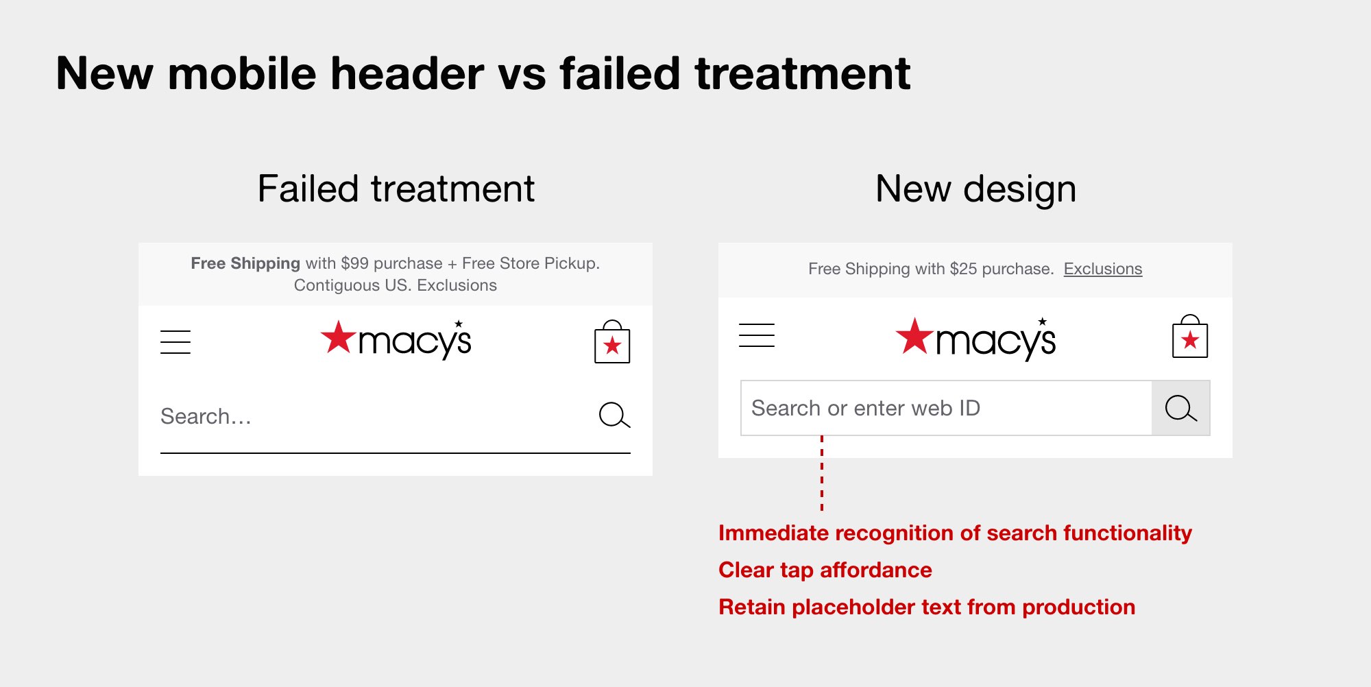
Restyled search field
One clear opportunity was styling the search field to look more like a search field. The old treatment perhaps took reduction a bridge too far, particularly with the importance of search to revenue.
Menu variations
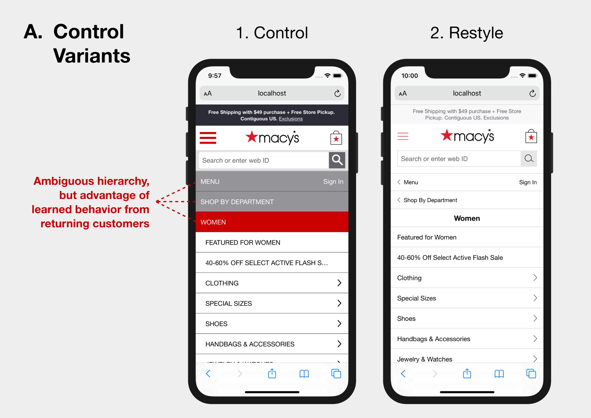
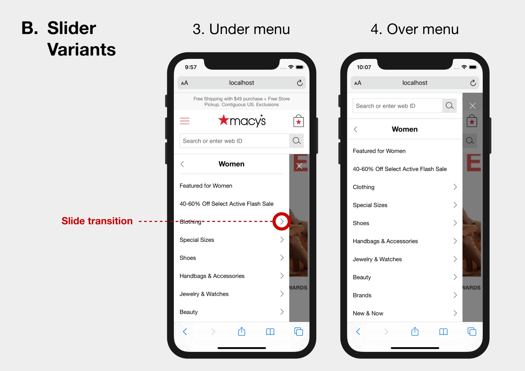
Mobile variations focused on persistent availability of search along with easier navigation affordances, including fixed headers and more responsive transitions. We even gave control a restyled variant, doubling control's chances of winning against our new treatments.
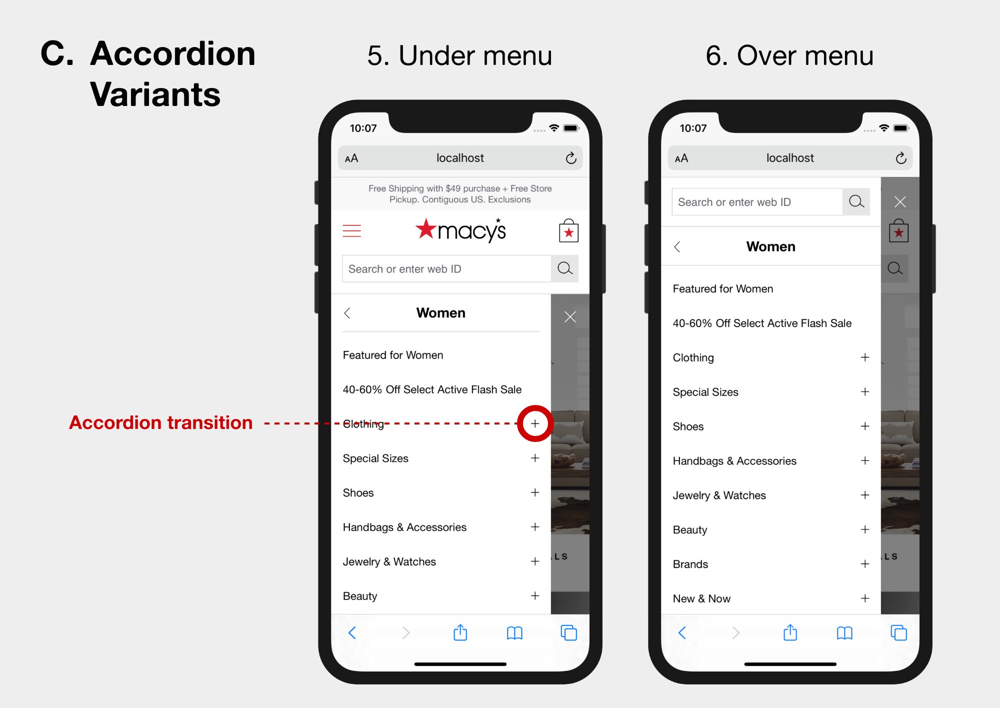
Desktop variations
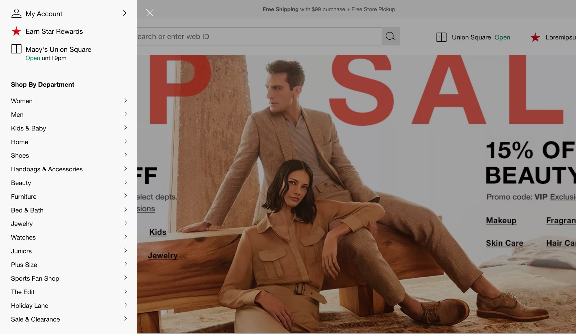
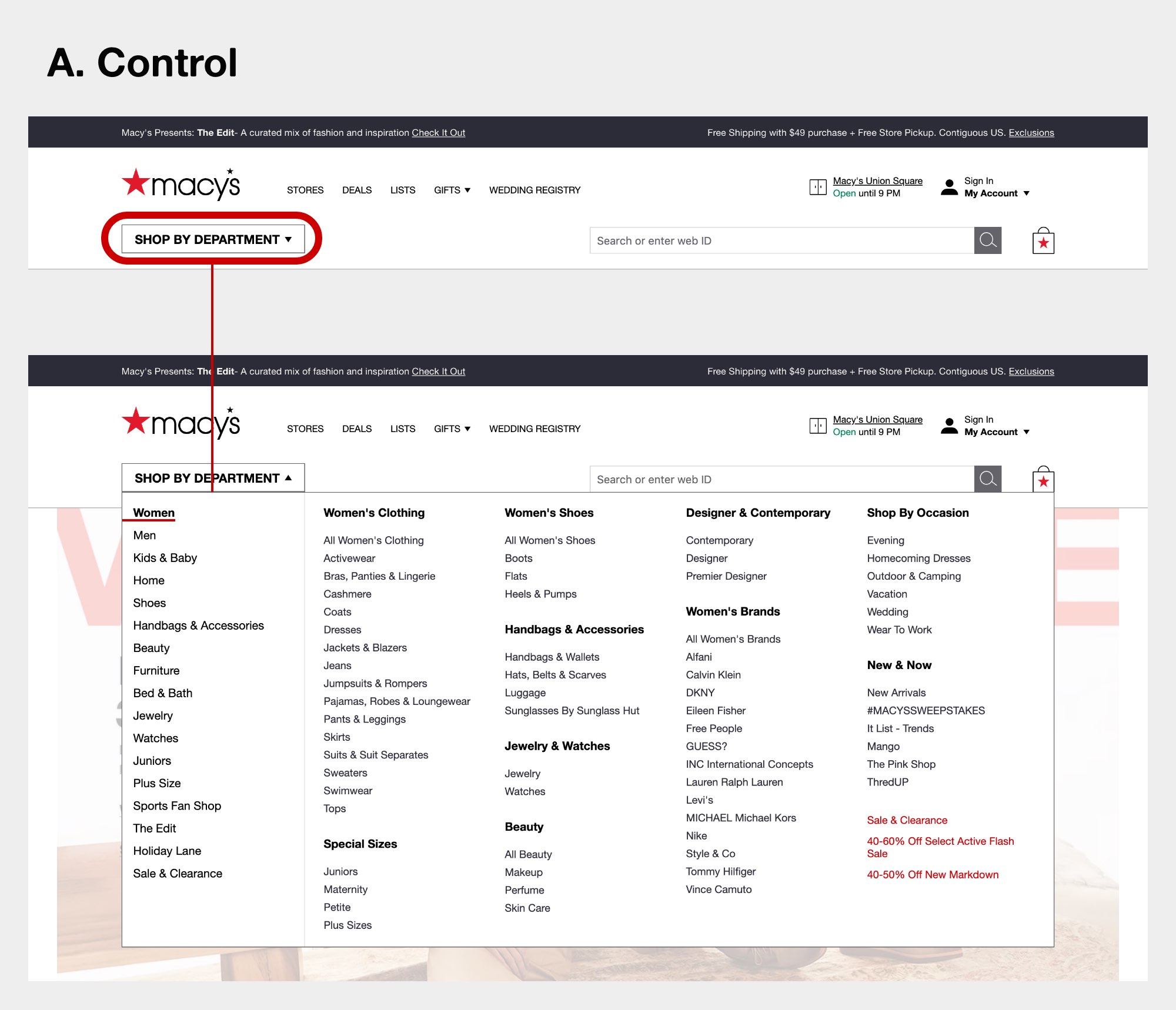
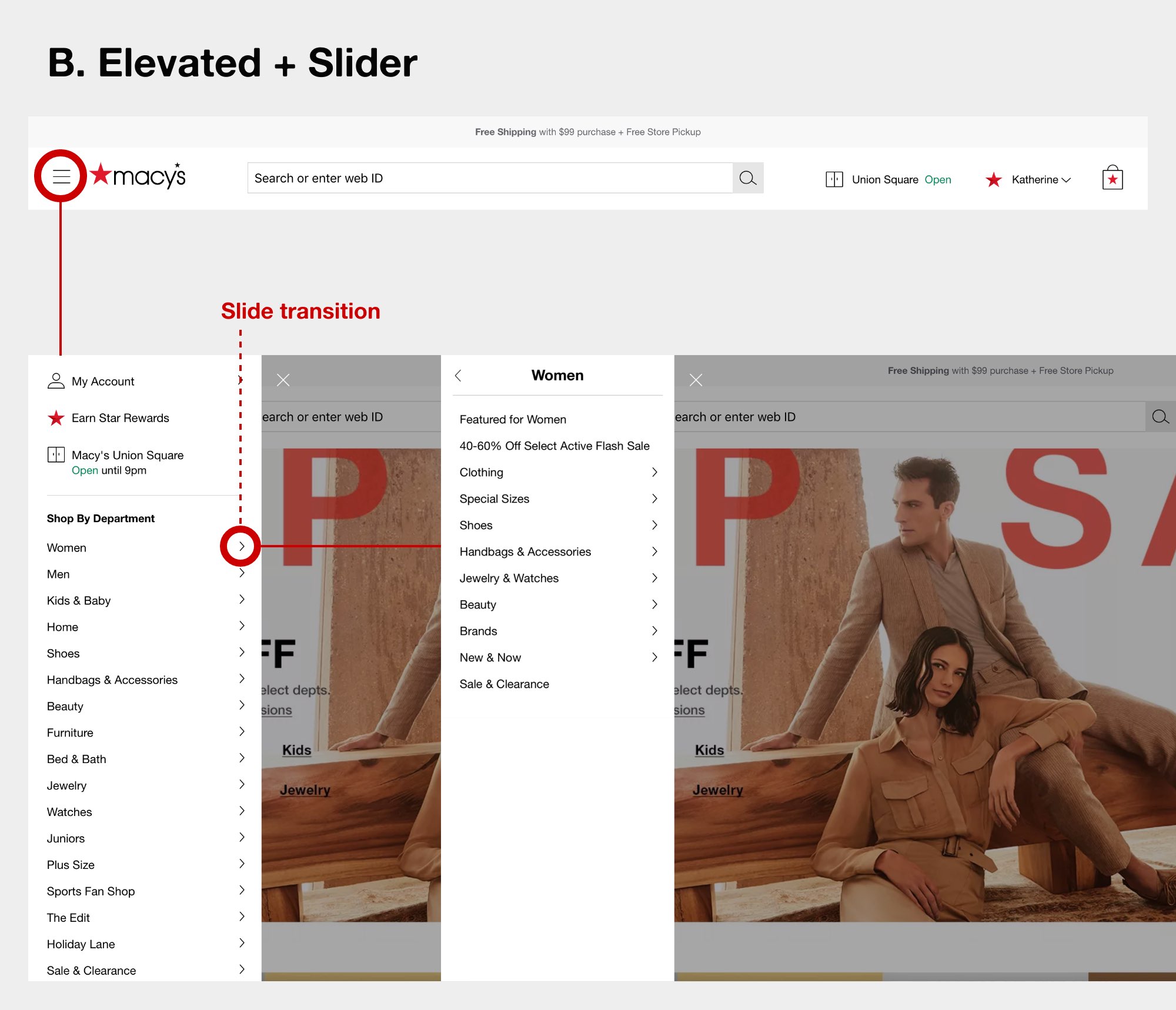
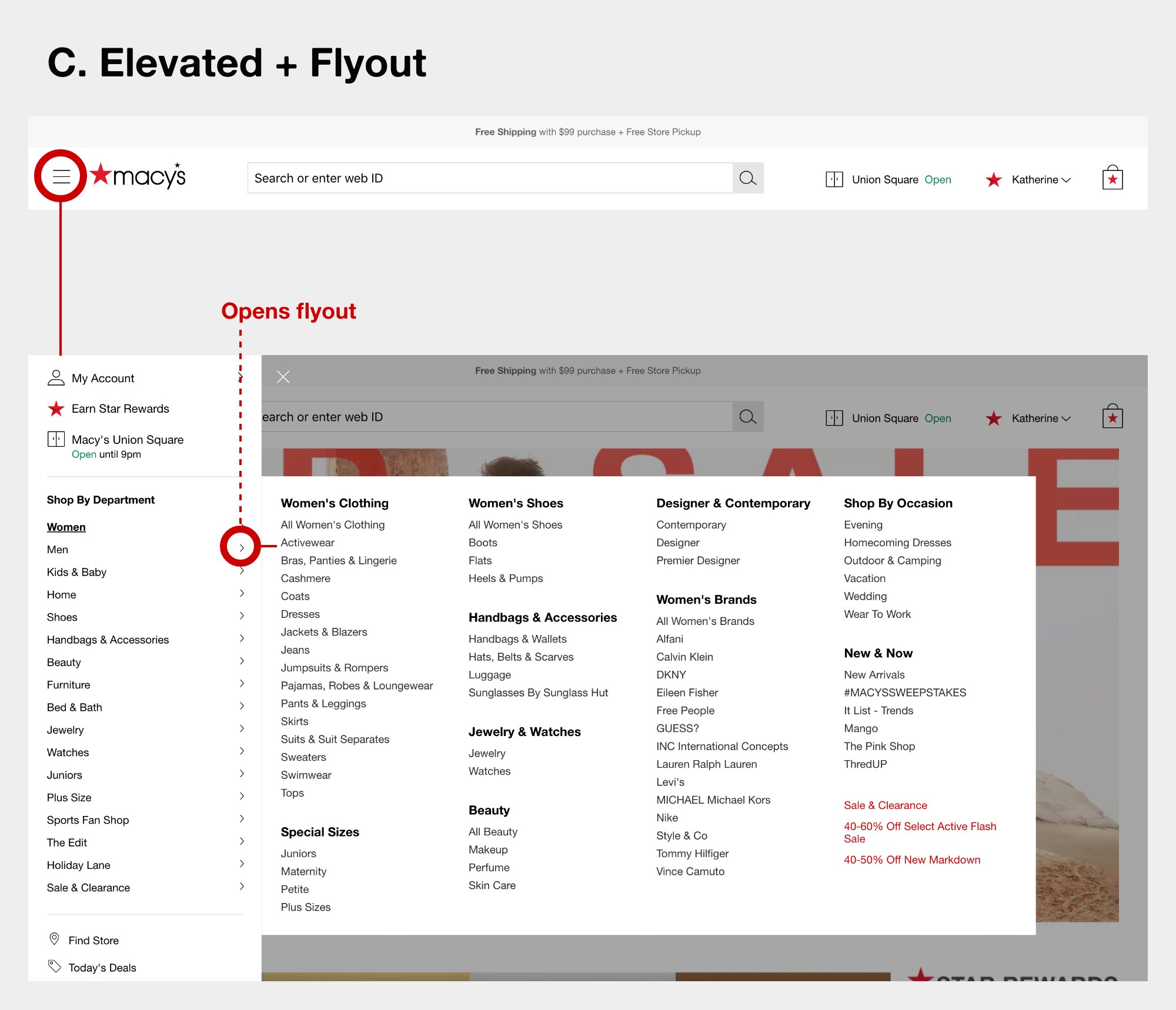
The failed treatment employed a slider navigation more suitable for small mobile screens. In a larger desktop screen, there is plenty of room for a mega flyout, allowing faster and more organic scanning and choice. A new treatment (variant C below) married the flyout with the simplified hamburger-to-sidebar menu.
Coded prototypes
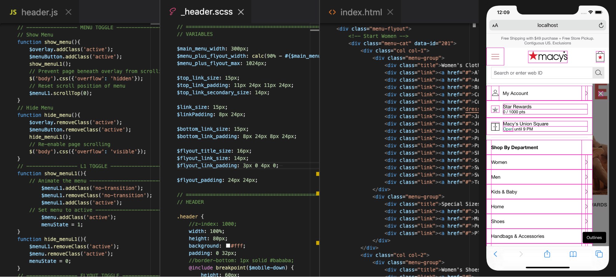
For task-based user testing, it was important to give users complete freedom of navigation, not a guided prototype. I built fully-working navigation prototypes in front-end code (HTML/CSS/JS) for all the treatments above, and with the complete information architecture of links for users to freely navigate the entire menu.
Coding the prototoypes had an additonal benefit of fine-tuning interactions and transitions to really craft an experience that feels, not just looks, right.
A cone of affordance (slowed down by 3x)
(Pink area for demonstration purposes only. Users would not see the pink areas.)
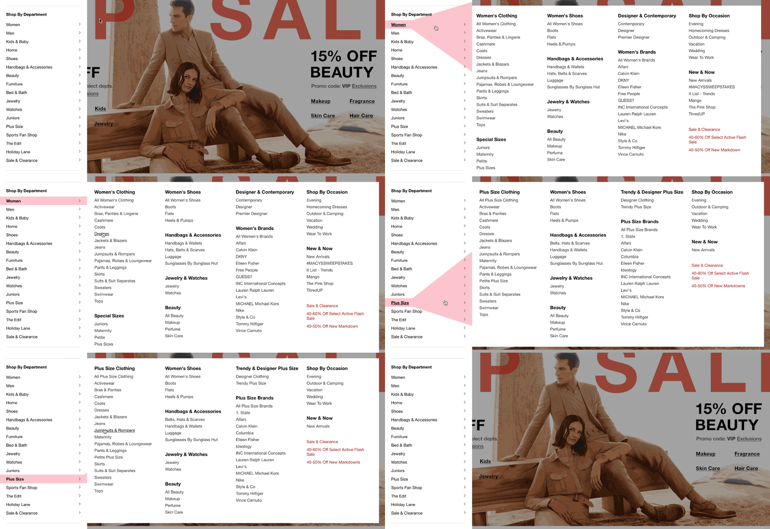
One of the biggest opportunities discovered in prototypes, I dubbed a "cone of affordance". This allows the user to move their cursor on an intuitive path without triggering a different menu. Its dynamic shape and movement invisibly assists the subtleties of cursor movement towards achieving micro-tasks up and down and diagonally-right.
User testing
Across eight detailed tasks, our mobile and desktop winners emerged with statistically significant data points in speed, accuracy, and confidence. Our users were completing tasks faster, choosing the correct path more often, and making selections with greater confidence.
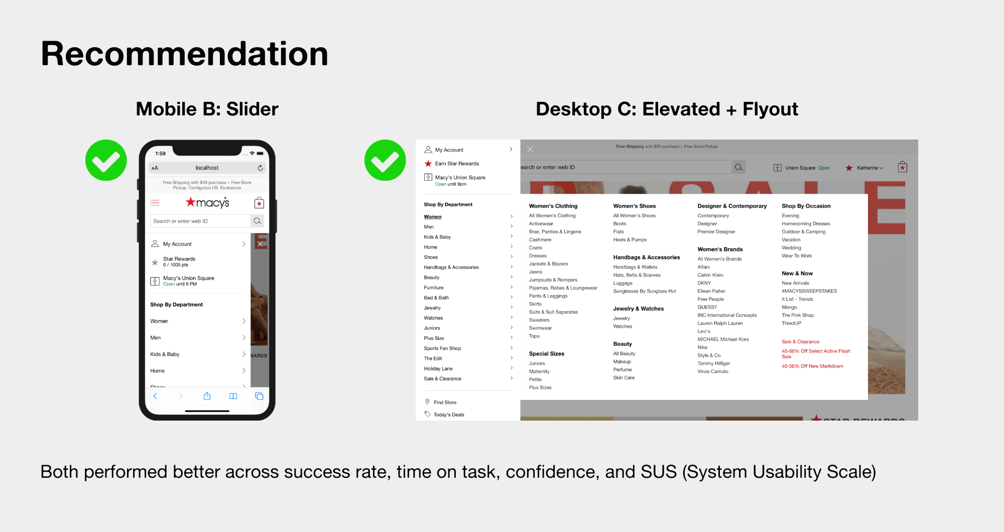
With our new test results, the team more confidently moved forward with new design recommendations and product teams had far greater confidence in our pivot. The new header and navigation is currently in development to be released for a new round of experimentation.