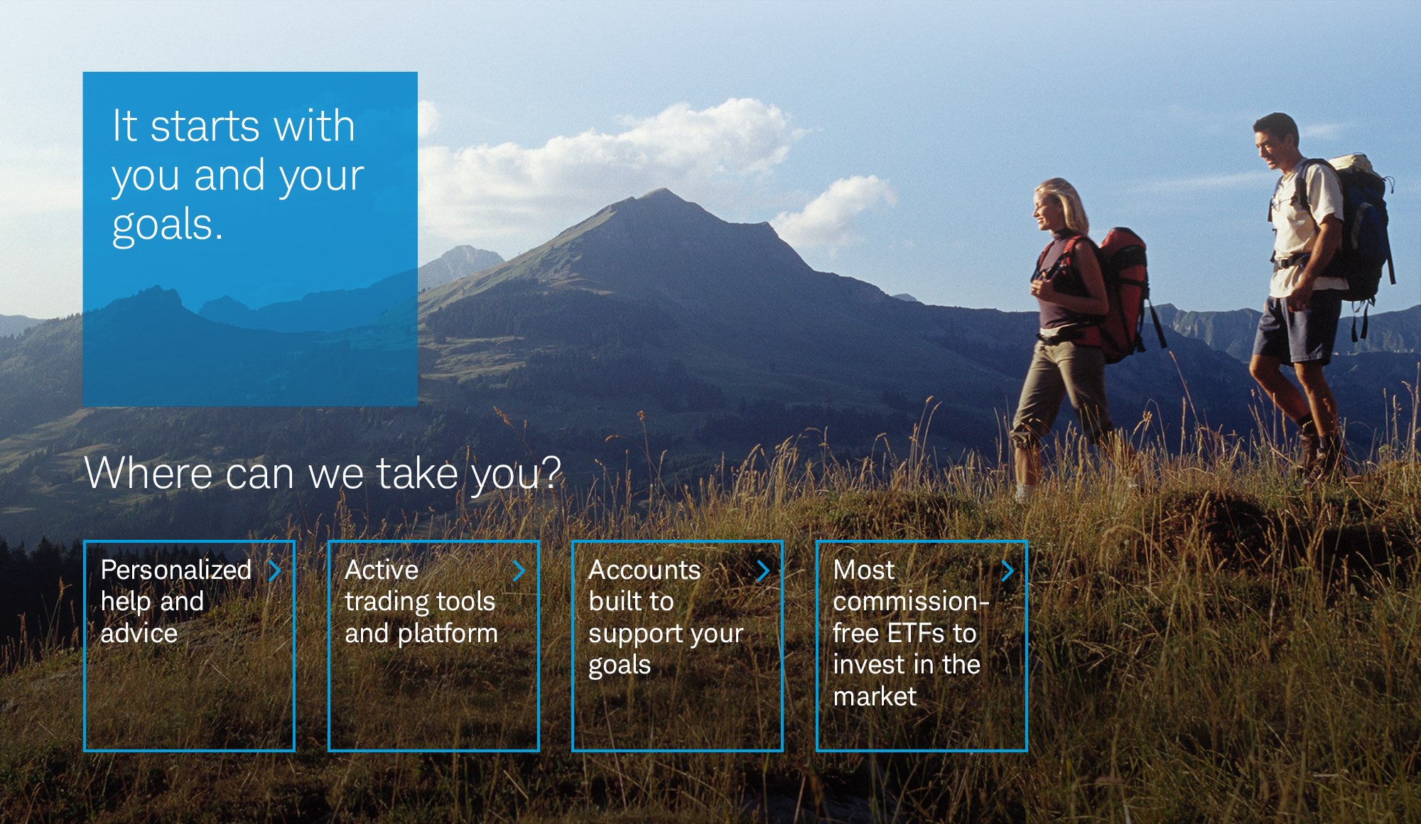
Redesigning Schwab.com through an iterative learning approach
We recommended an iterative approach to redesigning the Schwab website page by page and section by section to progressively learn and improve at each step. User testing was incorporated through each design refresh to validate, learn, and iterate. And we targeted key tent pole pages in the prospect journey to maximize our effect and feedback loop.
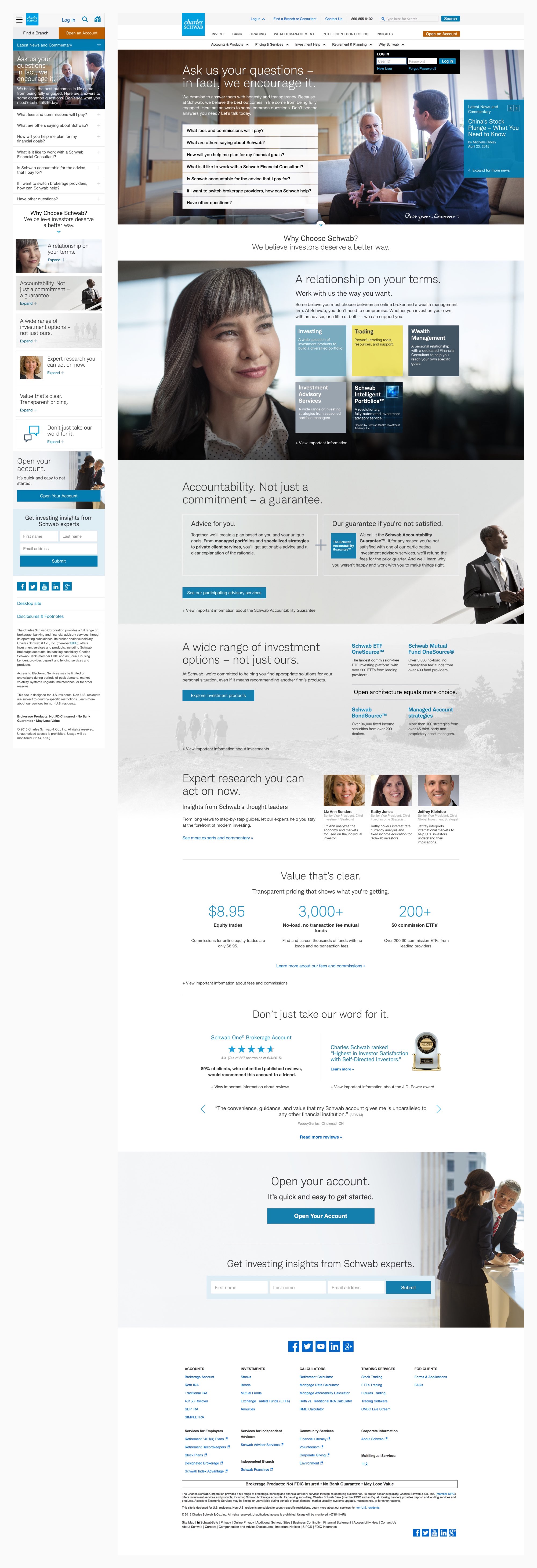
Our first homepage refresh
The majority of prospect traffic came through the home page, so this was the most natural place to begin testing and learning. Three concepts were taken into user testing resulting in an approach of simply answering people's most common questions in the most valuable marquee position.
Post-vision refresh
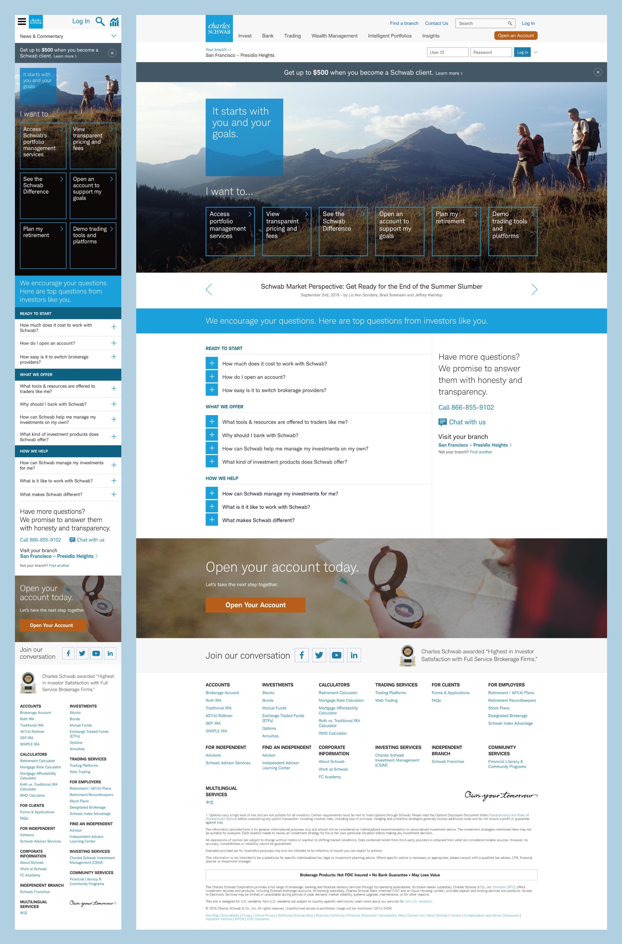
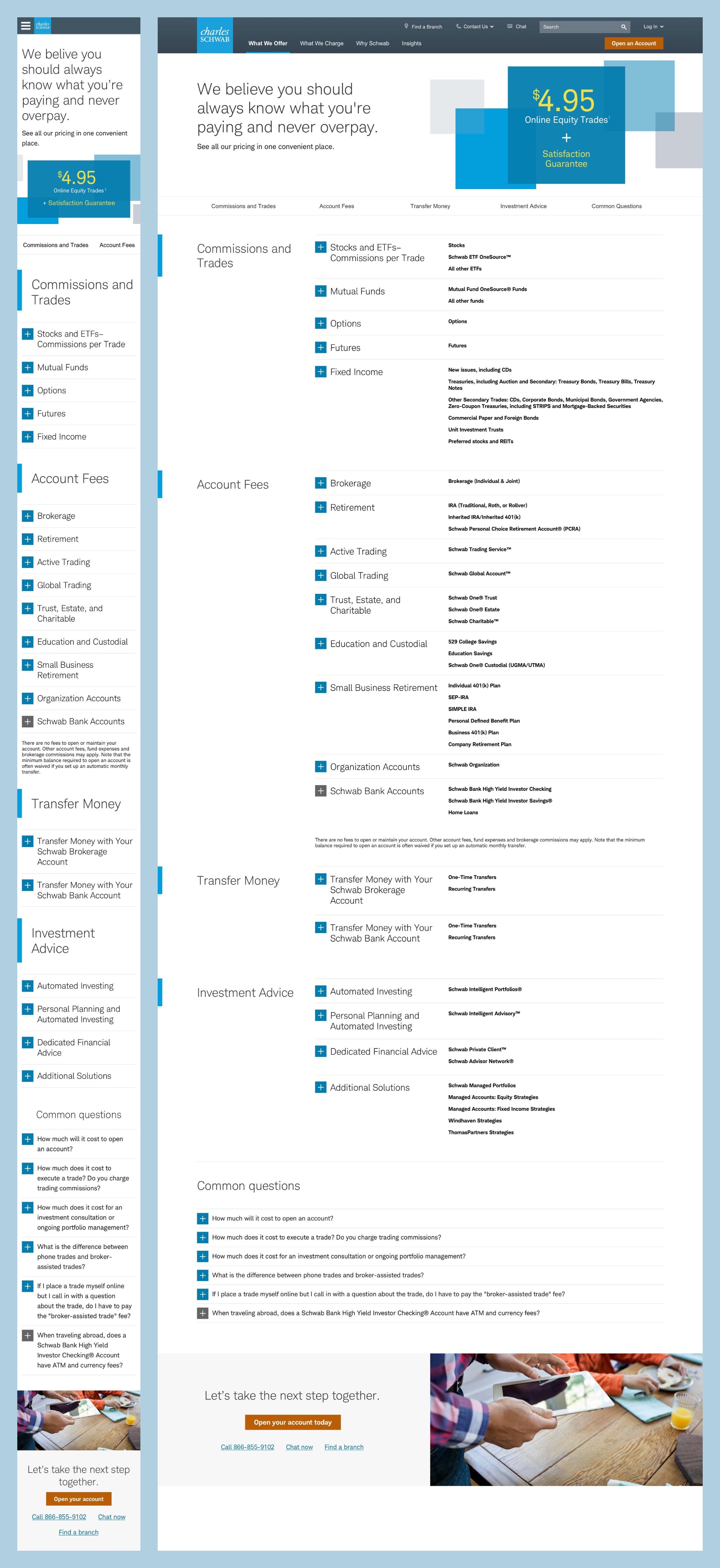
Following the vision work, we reapproached the homagepage again, retaining the most essential aspect of simply answering our prospects' questions. We also tackled the top pre-conversion page, the Pricing page, along with a sibling Costs of Investing page serving as a transparent breakdown of your true costs.

Expanding into content engagement
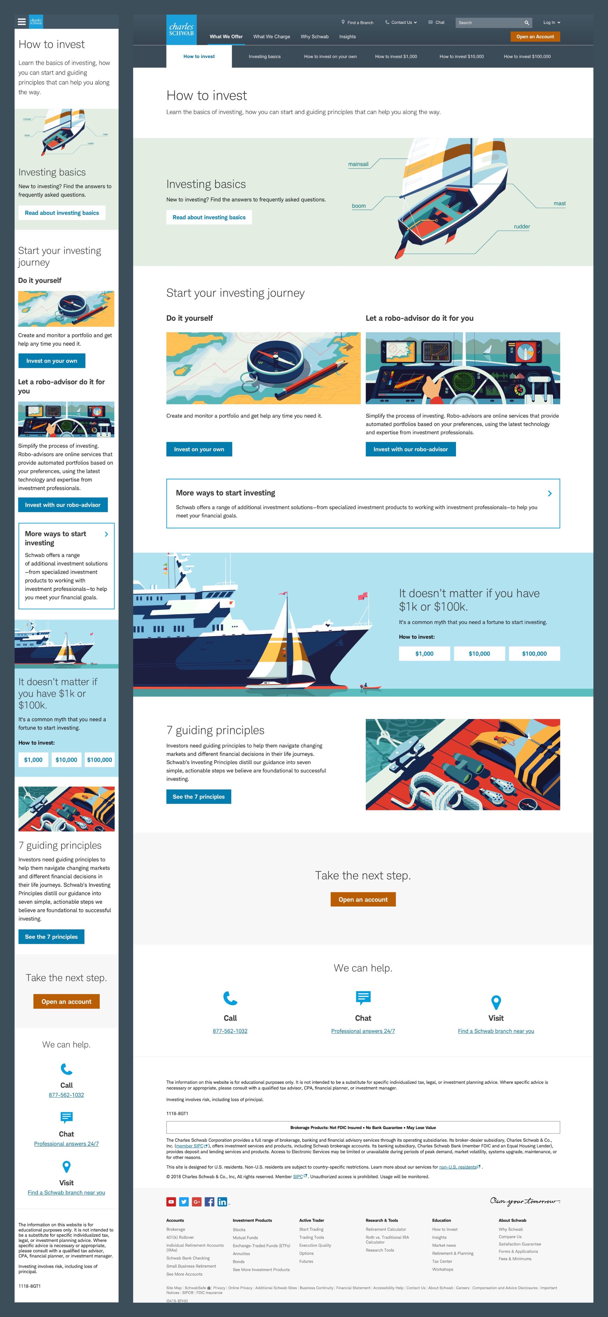
We followed these with deeper engagement in content, guiding prospects through Schwab's full- and self-service options and creating new content to make investing more accessible to beginners.


Refreshing key product pages
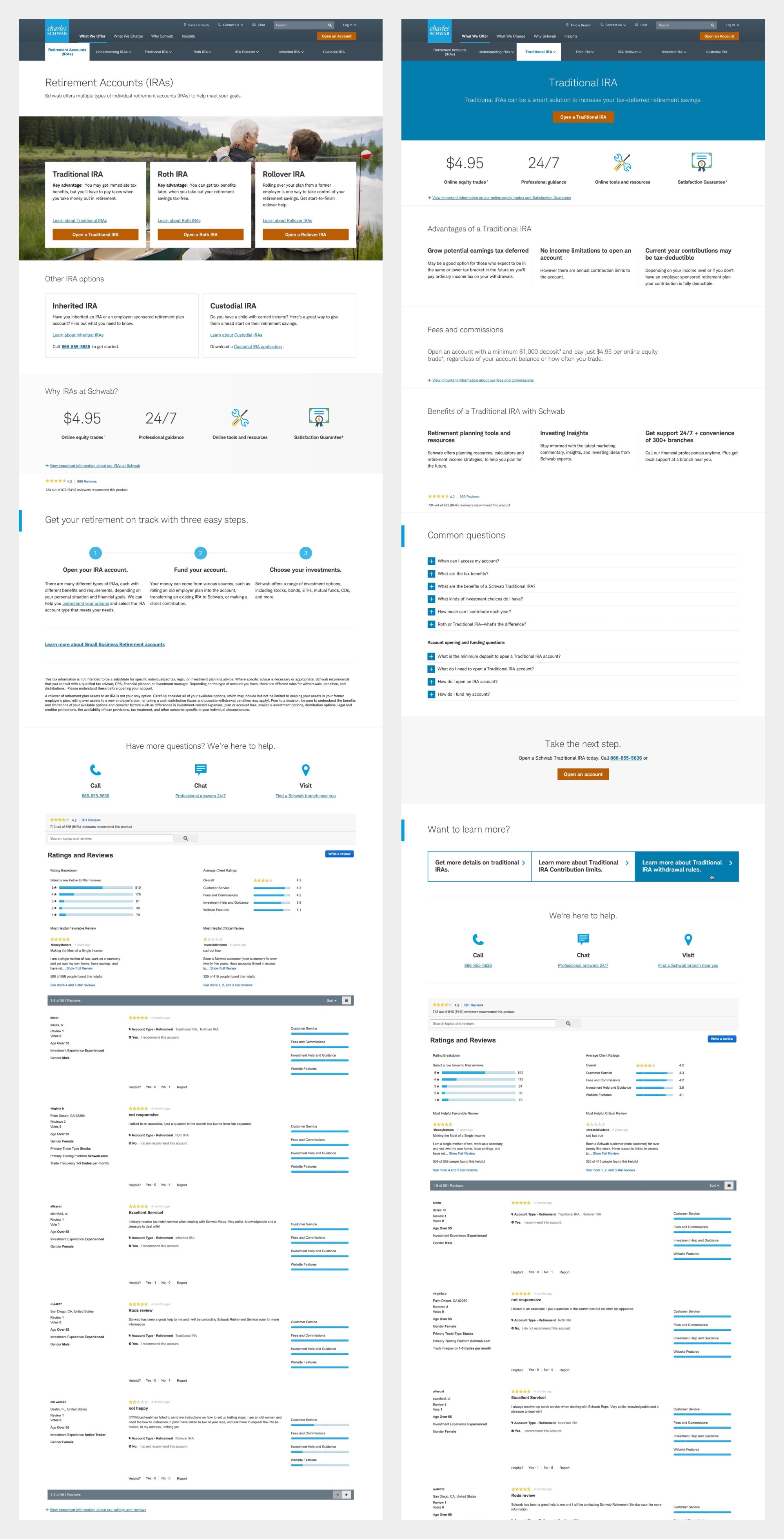
Our next focus was on key product and tool pages, bridging the final gap to serve a consistent refreshed experience for the most common prospect journeys.
Launching new services
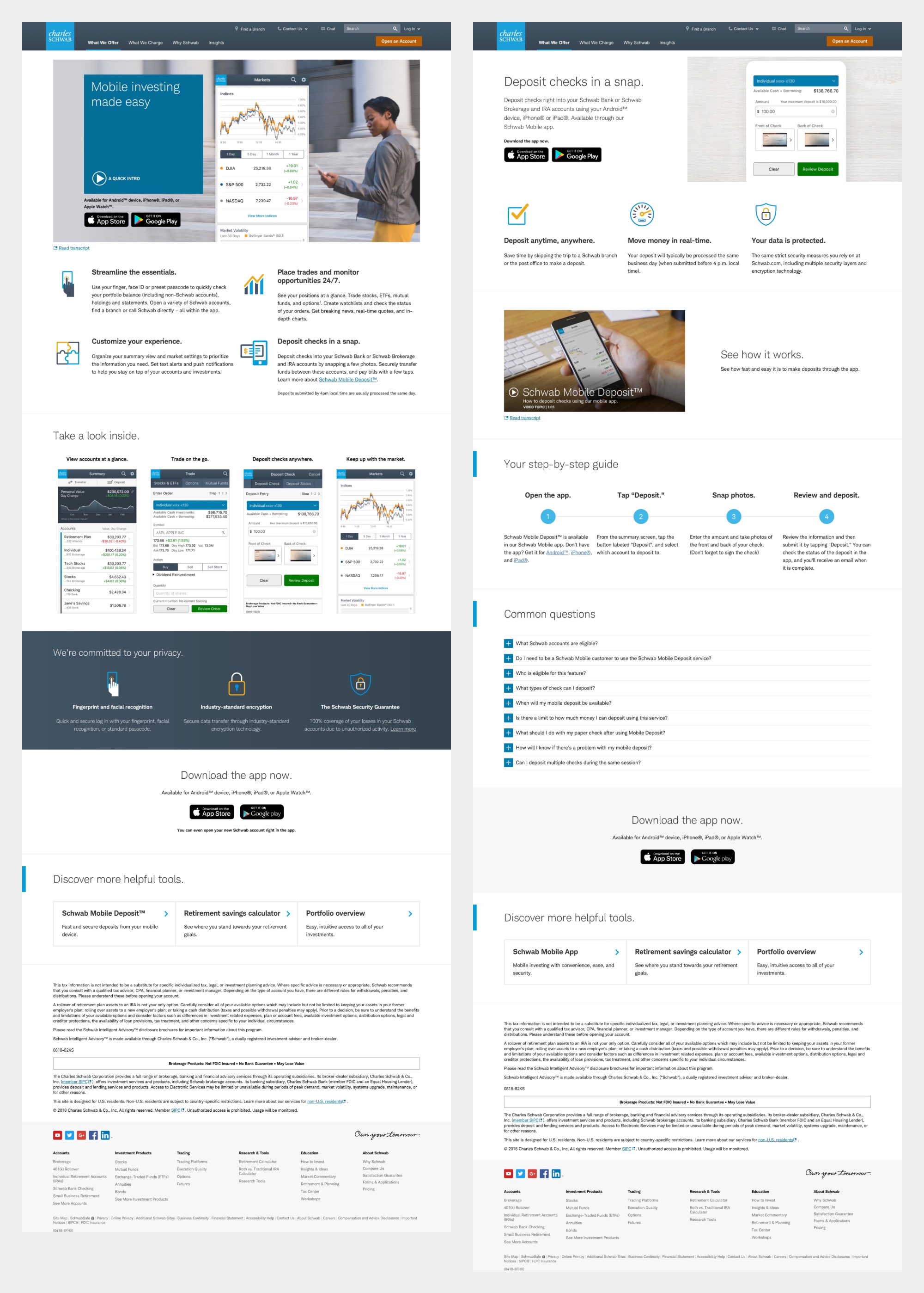
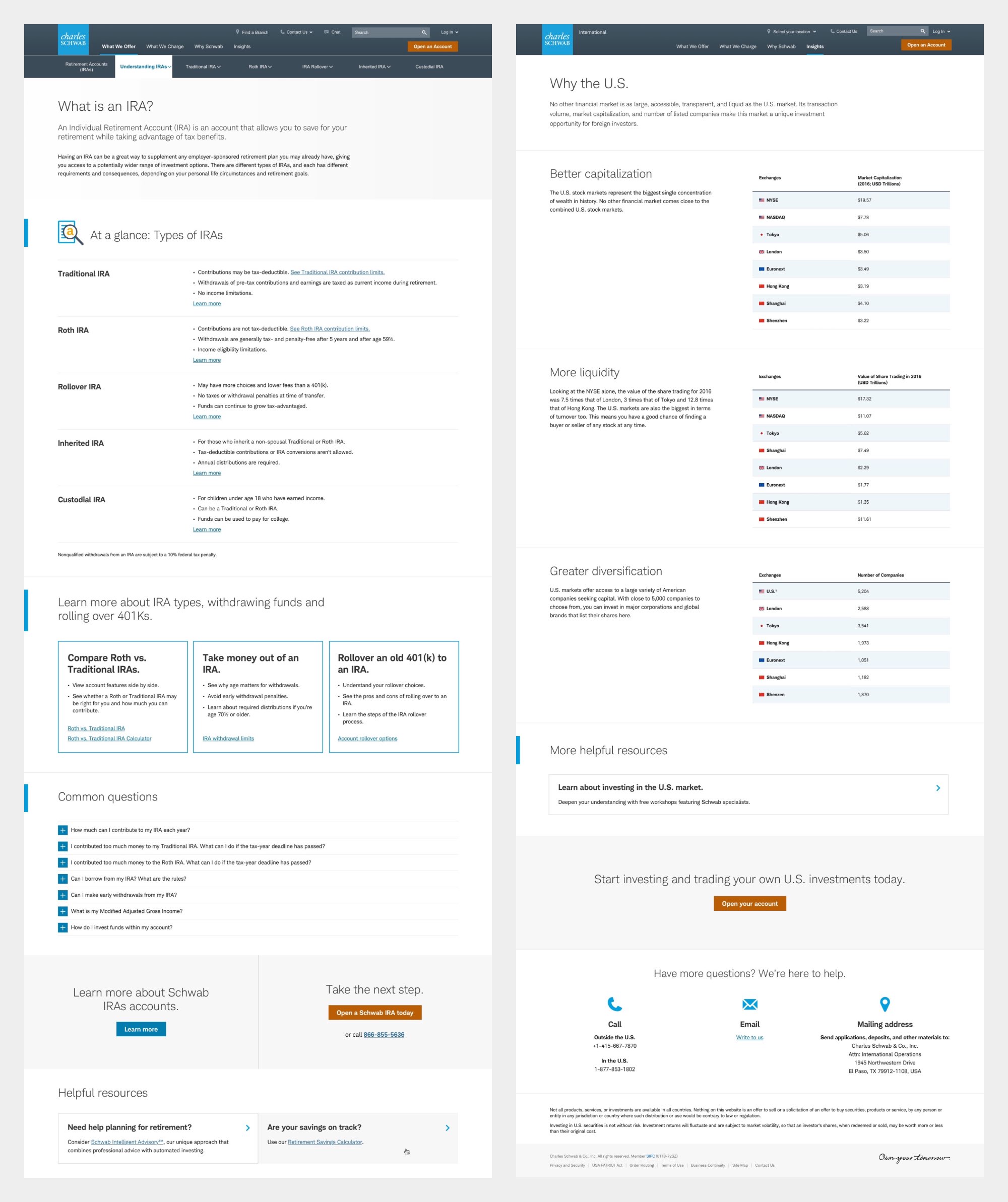
Our reputation within Schwab also got us introduced and invited to designing for other Schwab groups from new product offerings to international and Independent Branch Services.

